mirror of
https://github.com/lucide-icons/lucide.git
synced 2026-08-29 10:28:26 +02:00
 484f2c9cd3
* Update images

* Adjust color

* update accessebility

* Add matrix hero

* Add typescript documentation

* Add basics section to vue pages

* Add svelte docs

* Fix dynamic sidebar

* Add animation?

* Some adjustments

* Adjust animation

* Updates docs

* Add scaledown animation

* Add docs for vue types

* Fix layout accessibility page

* fix framework select

* adjust easing home animation

* Write docs for Vue

* Adjust animation home

* Adjust home hero animation

* Finish svelte docs

* Add solid pages

* remove spiral animation component

* Add group icons

* Added solid docs

* update preact docs

* Adjust examples preact docs

* Add snackplayer

* Get new editor

* Save this

* Add examples

* Adjust styling

* setup custom sandpack

* Add script

* Format files

* Make sandpack plugin work

* migrate react docs

* Fix svelte and solid examples

* Migrate to solid packages

* Add darkmode package logos

* Fix bug in selector

* migrate vue examples

* migrate advanced vue items

* migrate preact and svelte examples

* Add astro docs

* adding more docs on guide for lucide library

* Fix home animation

* Cleanup

* Added resources page, with more details and content

* Add hero badge for Version 1

* Fix vercel json

* Update missing paths

* Fix build?

* Replace lucide-vue-next

* Fix build

* Add some docs

* update markdown

* Setup angular docs

* Add basic angular docs

* Adjust code examples

* Update title and descriptions

* Update accessibility link

* Update title and description

* Add og image

* Fix alignment

* Add migration guides

* Adjust version 1 markdown file

* Add migration guide to the main list

* Minor fixes

* Update docs

* Apply feedback

* Select icons

* Add pointer events none

* Fix package links homepage

* Format code

* Fix types

* Fix focus

* Fix build

* Fix focus

* Apply feedback

* Adjust imports

* Adjust imports

* Fix search

* Apply feedback

* Fix import in font docs

* Small fixes

* docs(guide): added easter egg icon. stay tuned, guys 😉

* Add llm txt plugin

* Adjust logo top

* docs(version-1): upgraded @lucide/angular guide for v1 website (#4144)

* docs(guide/angular): rewrite some angular documentation

* docs(guide/angular): extens angular guide with combining icons & icon provider guides

* docs(guide/angular): fix angular sandbox, still needs @lucide/angular release tho

* docs(guide/angular): rework the getting started page a bit more, refactor some more prop=>input occurences

* docs(guide/angular): context provider => provideLucideConfig

* Update docs/guide/angular/migration.md

Co-authored-by: Eric Fennis <eric.fennis@gmail.com>

* Update docs/guide/angular/advanced/combining-icons.md

Co-authored-by: Eric Fennis <eric.fennis@gmail.com>

* Apply suggestions from code review

Co-authored-by: Copilot Autofix powered by AI <175728472+Copilot@users.noreply.github.com>

* docs(guide/angular): rework a11y for better flow & pacing

* docs(guide/angular): salvage original phrase, it has better flow

* docs(guide/angular): some more a11y nitpicking

* docs(guide/angular): reduce llm fatigue

* docs(guides/angular): fix app component selector

* docs(guides/angular): fix angular sandpacks

* Add sandpack angular to improve tree-shakable stack

* Update docs/guide/angular/getting-started.md

* docs(guides/angular): fix user import in combinding icons guide

* docs(guides/angular): fix nested SVG phrasing

* Update docs/guide/angular/advanced/with-lucide-lab.md

Co-authored-by: Copilot <175728472+Copilot@users.noreply.github.com>

* Update docs/guide/angular/advanced/filled-icons.md

Co-authored-by: Copilot <175728472+Copilot@users.noreply.github.com>

* docs(guides/angular): fix createLucideIcon guide

* docs(guides/angular): upgrade all relevant angular sandpack demos

---------

Co-authored-by: Eric Fennis <eric.fennis@gmail.com>
Co-authored-by: Copilot Autofix powered by AI <175728472+Copilot@users.noreply.github.com>

* fix(docs): add autogenerated OG images to gitignore

* fix(docs): unify the case of "Lucide" & "Lucide Lab" over all docs and readmes

* Fix build

* Add next tag to all installation guides

* Add top bar notification

* Minor fixes

* Update text

* Add todos

* Update og image

* Adjust install command

* Color top bar

* fix(docs): ignore all OG images, expect general.png

* fix(docs): fix the package list, hide @lucide/icons, downgrade angular logo, link to v0 guide, fix package title alignment

* Update docs/.vitepress/theme/components/base/LayoutTop.vue

Co-authored-by: Copilot <175728472+Copilot@users.noreply.github.com>

* Update docs/guide/react/advanced/dynamic-icon-component.md

Co-authored-by: Copilot <175728472+Copilot@users.noreply.github.com>

* Update CONTRIBUTING.md

Co-authored-by: Copilot <175728472+Copilot@users.noreply.github.com>

* Update docs/.vitepress/sidebar/resources.ts

Co-authored-by: Copilot <175728472+Copilot@users.noreply.github.com>

* Fix code example

* fix(docs): version 1 => Version 1

* feat(docs): add angular to new features in v1

* Fix next line issue

* feat(docs): fix typo (code example_s_)

* Fix deadlink

* feat(docs): fix some more typos and irky grammar

* feat(docs): fix lowercase lucide in sidebar 😅

* Update docs/guide/version-1.md

Co-authored-by: Karsa <contact@karsa.org>

---------

Co-authored-by: Karsa <contact@karsa.org>
Co-authored-by: Copilot Autofix powered by AI <175728472+Copilot@users.noreply.github.com>
200 lines
7.7 KiB
Markdown
200 lines
7.7 KiB
Markdown
---
|
|
description: Guidelines and best practices for designing icons for the Lucide icon library.
|
|
---
|
|
# Icon Design Guide
|
|
|
|
Guidelines and best practices for designing icons for the Lucide icon library.
|
|
|
|
## Icon Design Principles
|
|
|
|
Here are rules that should be followed to keep quality and consistency when making icons for Lucide.
|
|
|
|
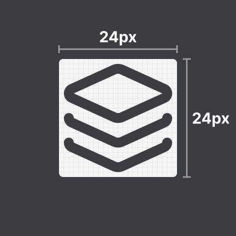
### 1. Icons must be designed on a **24 by 24 pixels** canvas.
|
|
|
|
|
|
|
|
### 2. Icons must have at least **1 pixel padding** within the canvas.
|
|
|
|

|
|
|
|
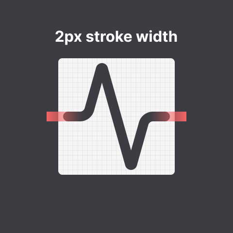
### 3. Icons must have a **stroke width of 2 pixels**.
|
|
|
|
|
|
|
|
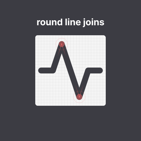
### 4. Icons must use **round joins**.
|
|
|
|
|
|
|
|
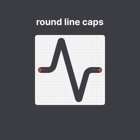
### 5. Icons must use **round caps**.
|
|
|
|
|
|
|
|
### 6. Icons must use **centered strokes**.
|
|
|
|

|
|
|
|
### 7. Shapes (such as rectangles) must have a **border radius of**
|
|
|
|
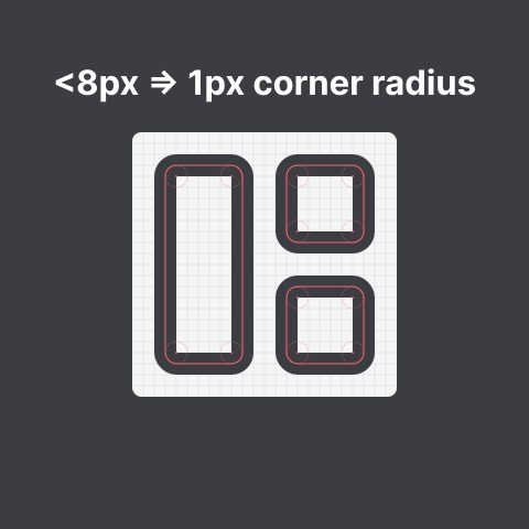
#### A. **2 pixels** if they are at least 8 pixels in size
|
|
|
|

|
|
|
|
#### B. **1 pixel** if they are smaller than 8 pixels in size
|
|
|
|
|
|
|
|
### 8. Distinct elements must have **2 pixels of spacing between each other**
|
|
|
|

|
|
|
|

|
|
|
|

|
|
|
|
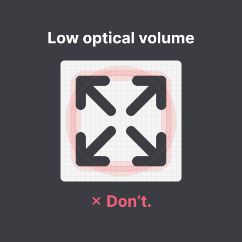
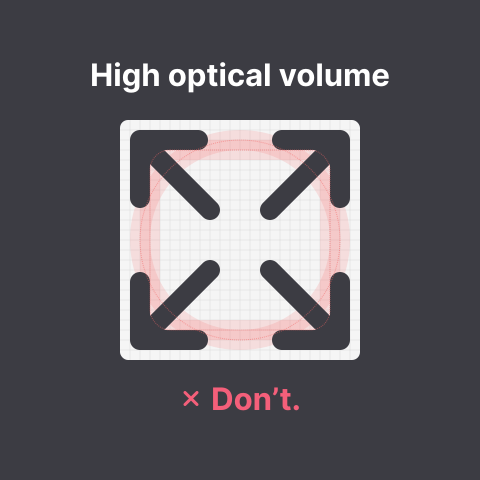
### 9. Icons should have a similar optical volume to `circle` and `square`.
|
|
|
|

|
|
|
|
|
|
|
|
|
|
|
|
**Tip:** place your icon next to the circle or square icon and blur them both; your icon should not feel much darker than the base shape.
|
|
|
|
### 10. Icons should be visually centered by their center of gravity.
|
|
|
|

|
|
|
|

|
|
|
|
**Tip:** place your icon both above/below and next to the square or circle icon and check if it feels off center. Symmetrical icons should always be aligned to the center.
|
|
|
|
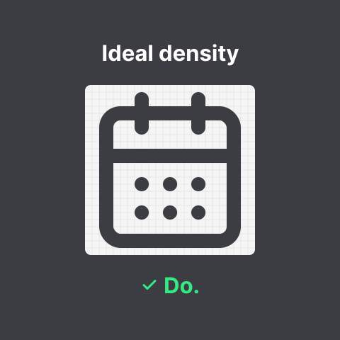
### 11. Icons should have similar visual density and level of detail.
|
|
|
|
|
|
|
|

|
|
|
|
**Tip:** try to make abstractions to dense elements. Blur your icon, and when blurred it should not feel overly dark.
|
|
|
|
### 12. Continuous curves should join smoothly.
|
|
|
|
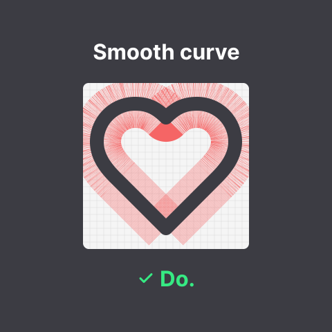
|
|
|
|

|
|
|
|
**Tip:** make sure to use arcs or quadratic curves. When using cubic curves control points should have mirrored angles for smooth curves.
|
|
|
|
### 13. Icons should aim to be pixel perfect so that they will be sharp on low DPI displays.
|
|
|
|
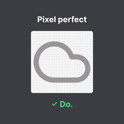
|
|
|
|
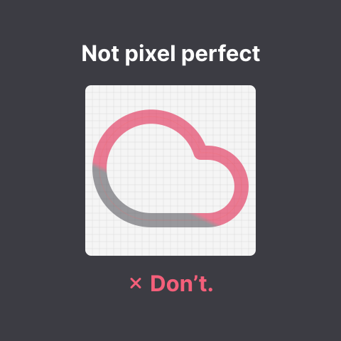
|
|
|
|
**Tip:** whenever possible align elements and arc centers to the grid.
|
|
|
|
### 14. Icons should share common shapes
|
|
|
|
You should try to create consistent groups and variants, reuse and try to create uniformity.
|
|
Consistency inside groups and variants has a lower priority than the rules above.
|
|
|
|
**Example:** All `-off` icons should look the same unless it for example violates the optical volume rule.
|
|
|
|
**Tip:** Try to not move the base shape to enable better use in a toggle context.
|
|
|
|
## Naming conventions
|
|
|
|
1. Icon names use lower kebab case.\
|
|
For example: `arrow-up` instead of `Arrow Up`.
|
|
|
|
2. Icon names use International English names, as opposed to local variants.\
|
|
For example: `color` instead of `colour`.
|
|
|
|
3. Icons should be named for what they depict rather than their use case or what they represent.\
|
|
For example: `floppy-disk` instead of `save` and `circle-slash` rather than `ban`.
|
|
|
|
4. Icons that are part of a group are named `<group>-<variant>`.\
|
|
For example: `badge-plus` is based on `badge`.
|
|
|
|
5. Icon names for alternate icons should represent what makes the alternate unique instead of being numbered.\
|
|
For example: `send-horizontal` instead of `send-2`.
|
|
|
|
6. Names containing numerals are not allowed, unless the number itself is represented in the icon.\
|
|
For example: `arrow-down-0-to-1` contains both numerals.
|
|
|
|
7. Icons depicting multiple elements (e.g. a person and a circle) of different sizes must list these elements in decreasing order of size.\
|
|
For example: if the circle is bigger, it should be `circle-person`, if the person is bigger, it should be `person-circle`.
|
|
|
|
8. Icons depicting multiple elements of roughly equal sizes (e.g. a `ruler` and a `pencil`) must list these elements front to back in case one element is in front of the other, otherwise in English reading order (top to bottom, left to right).\
|
|
For example: if the `pencil` is either in front of, above or left of `ruler`, it should be `pencil-ruler`, otherwise, it should be `ruler-pencil`.
|
|
|
|
9. Icons depicting some sort of variation of an element must use the `[element]-[modifier]` naming scheme, with modifiers being applied to each element respectively.\
|
|
For example: a dashed circle must be named `circle-dashed`, not `dashed-circle`, and in coordination with the previous guidelines, a dashed circle containing a broken heart would be named `circle-dashed-heart-broken`, due to the heart being smaller than the circle.
|
|
|
|
## Code Conventions
|
|
|
|
Before an icon is added to the library, we like to have readable and optimized SVG code.
|
|
|
|
### Global Attributes
|
|
|
|
For each icon these attributes are applied, corresponding to the above rules.
|
|
|
|
```xml
|
|
<svg
|
|
xmlns="http://www.w3.org/2000/svg"
|
|
width="24"
|
|
height="24"
|
|
viewBox="0 0 24 24"
|
|
fill="none"
|
|
stroke="currentColor"
|
|
stroke-width="2"
|
|
stroke-linecap="round"
|
|
stroke-linejoin="round"
|
|
>
|
|
<!-- SVGElements -->
|
|
</svg>
|
|
```
|
|
|
|
### Minify paths
|
|
|
|
The code of paths can sometimes get quite large. To reduce file size we like to minify the code.
|
|
We recommend to use [Lucide Studio](https://studio.lucide.dev/) to tidy paths to 3 points of precision.
|
|
|
|
### Allowed elements
|
|
|
|
SVG files may only contain simple path and shape elements, which may not have any attributes other than sizing and spacing.\
|
|
In practice only the following elements and attributes are allowed:
|
|
* `<path d>`
|
|
* `<line x1 x2>`
|
|
* `<polygon points>`
|
|
* `<polyline points>`
|
|
* `<circle cx cy r>`
|
|
* `<ellipse cx cy rx ry>`
|
|
* `<rect x y width height rx>`
|
|
|
|
This also means that no transforms, filters, fills or explicit strokes are allowed.
|
|
|
|
Never use [`<use>`](https://developer.mozilla.org/en-US/docs/Web/SVG/Element/use). While it may sometimes seem like a good way to optimize file size, there's no way to ensure that the referenced element IDs will be unique once the SVGs are embedded in HTML documents.
|
|
|
|
## JSON metadata descriptor
|
|
|
|
Each icon added must also come with a matching JSON file listing tags and categories for the icon.
|
|
Please use the following template:
|
|
|
|
```json
|
|
{
|
|
"$schema": "../icon.schema.json",
|
|
"contributors": [
|
|
"github-username",
|
|
"another-github-username"
|
|
],
|
|
"tags": [
|
|
"foo",
|
|
"bar"
|
|
],
|
|
"categories": [
|
|
"devices"
|
|
]
|
|
}
|
|
```
|