 484f2c9cd3
* Update images

* Adjust color

* update accessebility

* Add matrix hero

* Add typescript documentation

* Add basics section to vue pages

* Add svelte docs

* Fix dynamic sidebar

* Add animation?

* Some adjustments

* Adjust animation

* Updates docs

* Add scaledown animation

* Add docs for vue types

* Fix layout accessibility page

* fix framework select

* adjust easing home animation

* Write docs for Vue

* Adjust animation home

* Adjust home hero animation

* Finish svelte docs

* Add solid pages

* remove spiral animation component

* Add group icons

* Added solid docs

* update preact docs

* Adjust examples preact docs

* Add snackplayer

* Get new editor

* Save this

* Add examples

* Adjust styling

* setup custom sandpack

* Add script

* Format files

* Make sandpack plugin work

* migrate react docs

* Fix svelte and solid examples

* Migrate to solid packages

* Add darkmode package logos

* Fix bug in selector

* migrate vue examples

* migrate advanced vue items

* migrate preact and svelte examples

* Add astro docs

* adding more docs on guide for lucide library

* Fix home animation

* Cleanup

* Added resources page, with more details and content

* Add hero badge for Version 1

* Fix vercel json

* Update missing paths

* Fix build?

* Replace lucide-vue-next

* Fix build

* Add some docs

* update markdown

* Setup angular docs

* Add basic angular docs

* Adjust code examples

* Update title and descriptions

* Update accessibility link

* Update title and description

* Add og image

* Fix alignment

* Add migration guides

* Adjust version 1 markdown file

* Add migration guide to the main list

* Minor fixes

* Update docs

* Apply feedback

* Select icons

* Add pointer events none

* Fix package links homepage

* Format code

* Fix types

* Fix focus

* Fix build

* Fix focus

* Apply feedback

* Adjust imports

* Adjust imports

* Fix search

* Apply feedback

* Fix import in font docs

* Small fixes

* docs(guide): added easter egg icon. stay tuned, guys 😉

* Add llm txt plugin

* Adjust logo top

* docs(version-1): upgraded @lucide/angular guide for v1 website (#4144)

* docs(guide/angular): rewrite some angular documentation

* docs(guide/angular): extens angular guide with combining icons & icon provider guides

* docs(guide/angular): fix angular sandbox, still needs @lucide/angular release tho

* docs(guide/angular): rework the getting started page a bit more, refactor some more prop=>input occurences

* docs(guide/angular): context provider => provideLucideConfig

* Update docs/guide/angular/migration.md

Co-authored-by: Eric Fennis <eric.fennis@gmail.com>

* Update docs/guide/angular/advanced/combining-icons.md

Co-authored-by: Eric Fennis <eric.fennis@gmail.com>

* Apply suggestions from code review

Co-authored-by: Copilot Autofix powered by AI <175728472+Copilot@users.noreply.github.com>

* docs(guide/angular): rework a11y for better flow & pacing

* docs(guide/angular): salvage original phrase, it has better flow

* docs(guide/angular): some more a11y nitpicking

* docs(guide/angular): reduce llm fatigue

* docs(guides/angular): fix app component selector

* docs(guides/angular): fix angular sandpacks

* Add sandpack angular to improve tree-shakable stack

* Update docs/guide/angular/getting-started.md

* docs(guides/angular): fix user import in combinding icons guide

* docs(guides/angular): fix nested SVG phrasing

* Update docs/guide/angular/advanced/with-lucide-lab.md

Co-authored-by: Copilot <175728472+Copilot@users.noreply.github.com>

* Update docs/guide/angular/advanced/filled-icons.md

Co-authored-by: Copilot <175728472+Copilot@users.noreply.github.com>

* docs(guides/angular): fix createLucideIcon guide

* docs(guides/angular): upgrade all relevant angular sandpack demos

---------

Co-authored-by: Eric Fennis <eric.fennis@gmail.com>
Co-authored-by: Copilot Autofix powered by AI <175728472+Copilot@users.noreply.github.com>

* fix(docs): add autogenerated OG images to gitignore

* fix(docs): unify the case of "Lucide" & "Lucide Lab" over all docs and readmes

* Fix build

* Add next tag to all installation guides

* Add top bar notification

* Minor fixes

* Update text

* Add todos

* Update og image

* Adjust install command

* Color top bar

* fix(docs): ignore all OG images, expect general.png

* fix(docs): fix the package list, hide @lucide/icons, downgrade angular logo, link to v0 guide, fix package title alignment

* Update docs/.vitepress/theme/components/base/LayoutTop.vue

Co-authored-by: Copilot <175728472+Copilot@users.noreply.github.com>

* Update docs/guide/react/advanced/dynamic-icon-component.md

Co-authored-by: Copilot <175728472+Copilot@users.noreply.github.com>

* Update CONTRIBUTING.md

Co-authored-by: Copilot <175728472+Copilot@users.noreply.github.com>

* Update docs/.vitepress/sidebar/resources.ts

Co-authored-by: Copilot <175728472+Copilot@users.noreply.github.com>

* Fix code example

* fix(docs): version 1 => Version 1

* feat(docs): add angular to new features in v1

* Fix next line issue

* feat(docs): fix typo (code example_s_)

* Fix deadlink

* feat(docs): fix some more typos and irky grammar

* feat(docs): fix lowercase lucide in sidebar 😅

* Update docs/guide/version-1.md

Co-authored-by: Karsa <contact@karsa.org>

---------

Co-authored-by: Karsa <contact@karsa.org>
Co-authored-by: Copilot Autofix powered by AI <175728472+Copilot@users.noreply.github.com>
7.7 KiB
description
| description |
|---|
| Guidelines and best practices for designing icons for the Lucide icon library. |
Icon Design Guide
Guidelines and best practices for designing icons for the Lucide icon library.
Icon Design Principles
Here are rules that should be followed to keep quality and consistency when making icons for Lucide.
1. Icons must be designed on a 24 by 24 pixels canvas.
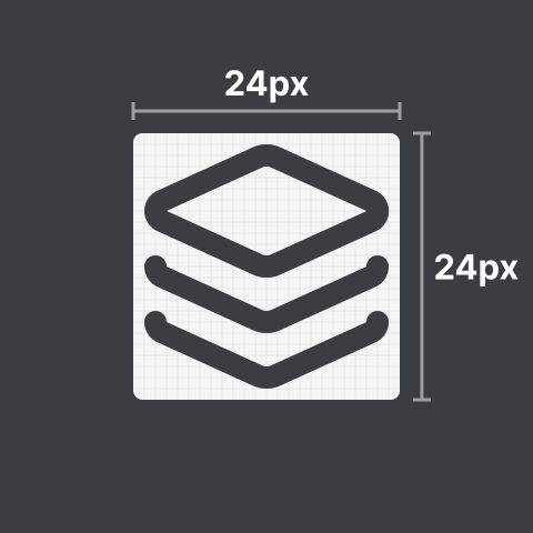
2. Icons must have at least 1 pixel padding within the canvas.

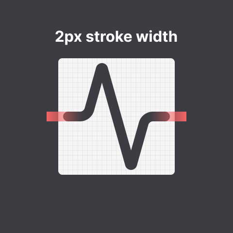
3. Icons must have a stroke width of 2 pixels.
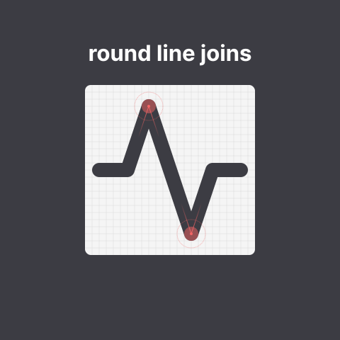
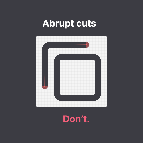
4. Icons must use round joins.
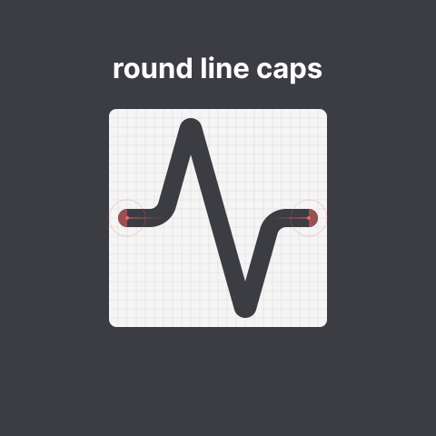
5. Icons must use round caps.
6. Icons must use centered strokes.

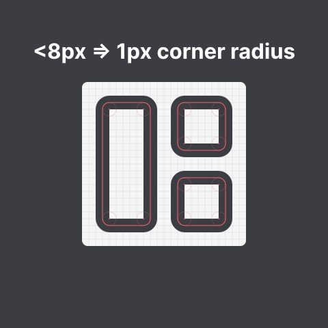
7. Shapes (such as rectangles) must have a border radius of
A. 2 pixels if they are at least 8 pixels in size

B. 1 pixel if they are smaller than 8 pixels in size
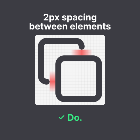
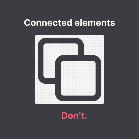
8. Distinct elements must have 2 pixels of spacing between each other
9. Icons should have a similar optical volume to circle and square.

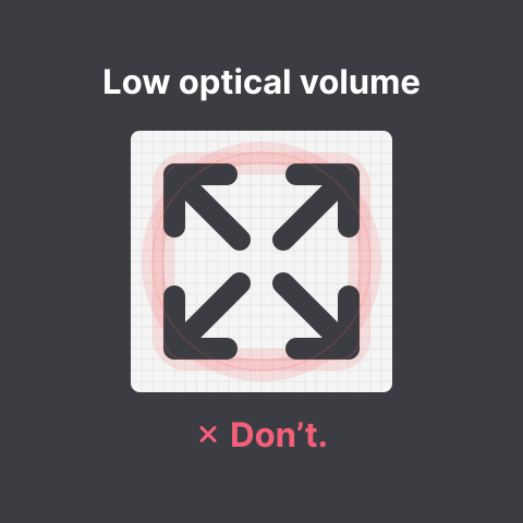
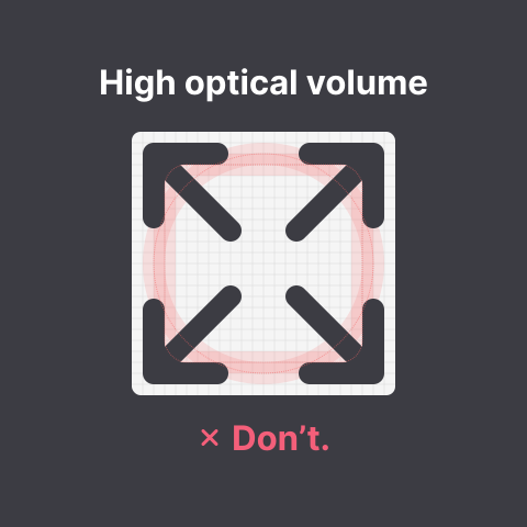
Tip: place your icon next to the circle or square icon and blur them both; your icon should not feel much darker than the base shape.
10. Icons should be visually centered by their center of gravity.


Tip: place your icon both above/below and next to the square or circle icon and check if it feels off center. Symmetrical icons should always be aligned to the center.
11. Icons should have similar visual density and level of detail.
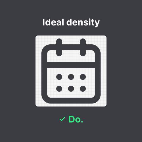

Tip: try to make abstractions to dense elements. Blur your icon, and when blurred it should not feel overly dark.
12. Continuous curves should join smoothly.
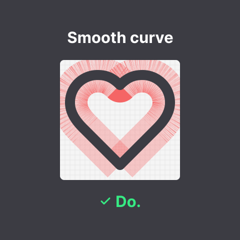

Tip: make sure to use arcs or quadratic curves. When using cubic curves control points should have mirrored angles for smooth curves.
13. Icons should aim to be pixel perfect so that they will be sharp on low DPI displays.
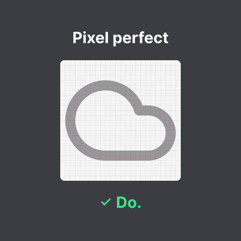
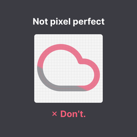
Tip: whenever possible align elements and arc centers to the grid.
14. Icons should share common shapes
You should try to create consistent groups and variants, reuse and try to create uniformity. Consistency inside groups and variants has a lower priority than the rules above.
Example: All -off icons should look the same unless it for example violates the optical volume rule.
Tip: Try to not move the base shape to enable better use in a toggle context.
Naming conventions
-
Icon names use lower kebab case.
For example:arrow-upinstead ofArrow Up. -
Icon names use International English names, as opposed to local variants.
For example:colorinstead ofcolour. -
Icons should be named for what they depict rather than their use case or what they represent.
For example:floppy-diskinstead ofsaveandcircle-slashrather thanban. -
Icons that are part of a group are named
<group>-<variant>.
For example:badge-plusis based onbadge. -
Icon names for alternate icons should represent what makes the alternate unique instead of being numbered.
For example:send-horizontalinstead ofsend-2. -
Names containing numerals are not allowed, unless the number itself is represented in the icon.
For example:arrow-down-0-to-1contains both numerals. -
Icons depicting multiple elements (e.g. a person and a circle) of different sizes must list these elements in decreasing order of size.
For example: if the circle is bigger, it should becircle-person, if the person is bigger, it should beperson-circle. -
Icons depicting multiple elements of roughly equal sizes (e.g. a
rulerand apencil) must list these elements front to back in case one element is in front of the other, otherwise in English reading order (top to bottom, left to right).
For example: if thepencilis either in front of, above or left ofruler, it should bepencil-ruler, otherwise, it should beruler-pencil. -
Icons depicting some sort of variation of an element must use the
[element]-[modifier]naming scheme, with modifiers being applied to each element respectively.
For example: a dashed circle must be namedcircle-dashed, notdashed-circle, and in coordination with the previous guidelines, a dashed circle containing a broken heart would be namedcircle-dashed-heart-broken, due to the heart being smaller than the circle.
Code Conventions
Before an icon is added to the library, we like to have readable and optimized SVG code.
Global Attributes
For each icon these attributes are applied, corresponding to the above rules.
<svg
  xmlns="http://www.w3.org/2000/svg"
  width="24"
  height="24"
  viewBox="0 0 24 24"
  fill="none"
  stroke="currentColor"
  stroke-width="2"
  stroke-linecap="round"
  stroke-linejoin="round"
>
  <!-- SVGElements -->
</svg>
Minify paths
The code of paths can sometimes get quite large. To reduce file size we like to minify the code. We recommend to use Lucide Studio to tidy paths to 3 points of precision.
Allowed elements
SVG files may only contain simple path and shape elements, which may not have any attributes other than sizing and spacing.
In practice only the following elements and attributes are allowed:
<path d><line x1 x2><polygon points><polyline points><circle cx cy r><ellipse cx cy rx ry><rect x y width height rx>
This also means that no transforms, filters, fills or explicit strokes are allowed.
Never use <use>. While it may sometimes seem like a good way to optimize file size, there's no way to ensure that the referenced element IDs will be unique once the SVGs are embedded in HTML documents.
JSON metadata descriptor
Each icon added must also come with a matching JSON file listing tags and categories for the icon. Please use the following template:
{
  "$schema": "../icon.schema.json",
  "contributors": [
    "github-username",
    "another-github-username"
  ],
  "tags": [
    "foo",
    "bar"
  ],
  "categories": [
    "devices"
  ]
}